Four and a half years ago I slogged through the process of making the Ubuntu terminal look like the Mac OS X terminal.
Fast forward to today: when playing with Windows 11, I realized that Microsoft now has a pretty solid terminal program built-in that supports both theming and tabs! A little while later, and…

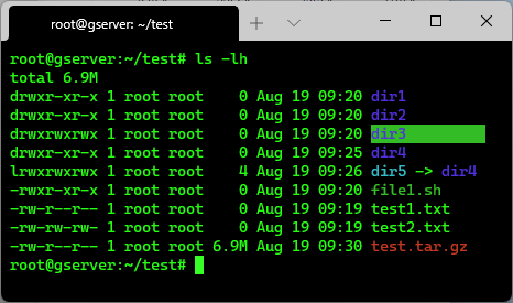
(you can click for a larger image)
A few caveats before we continue:
- Fonts aren’t identical since Windows 11 doesn’t come with a number of OSX/macOS fonts. I added code comments with the original font names in case you’re wanting to go the extra mile.
- I changed a few colors for readability. Original Apple colors are listed in the code comments anywhere a change was made.
- The colors I used are for older Mac OS X versions of Terminal. There is no distinction between normal and bright variants. The newer versions of macOS seem list the standard ANSI colors across every theme.
- Transparency/blur doesn’t behave identically in Windows vs the Mac. I copied the % value for transparency, but you may want to experiment here.
- I have duplicate font and opacity methods, as depending on your version, you may need one or the other (duplicates don’t have any negative impact thus far).
With that out of the way, let’s get started!
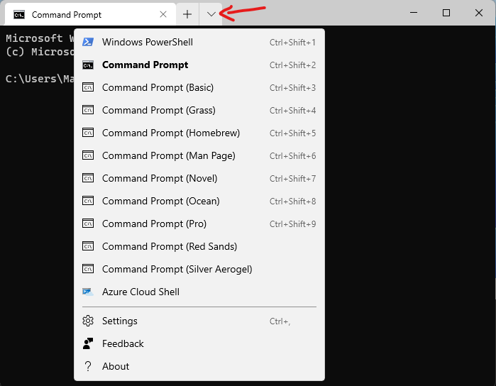
Open Windows Terminal (the easiest way is to click START and then start typing “Terminal”). Once it’s open, click the little down arrow as seen above, and choose SETTINGS.
It will ask you to open/edit a JSON file. I just used Notepad for this, but any text editor will do.
Your file should look something like this:
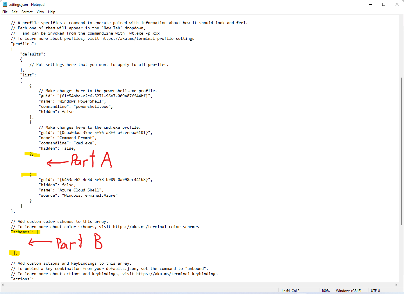
…if you aren’t familiar with JSON, before doing anything else you should probably select everything, copy/paste into a new document, and save the new document somewhere so that can undo everything easily if things go wonky.
Next, within your settings.json file you will need to add some spacing as I did in the image above (click for a larger image). In that space for PART A and PART B, you’ll be pasting the text for whatever theme(s) you want (each theme has a PART A and PART B that must be added).
I suggest starting with 1 theme, and then adding additional ones later. For reference, you can see the JSON file I’m currently using (similar to the items below but with changes) at:
matt-windows-terminal-settings-json.txt
BASIC
The default Mac OS X terminal color. Good contrast, easy to read.
Part A:
{
"name": "Command Prompt (Basic)",
"commandline": "cmd.exe",
"hidden": false,

// Apple originally used Menlo Regular 11 and SF Mono Regular 11
// Similar fonts in Windows 11 are Consolas, Cascadia Code, Lucida Console
"font":
    {
    "face": "Consolas",
    "size": 10,
    "weight": "normal",
    },
"fontFace": "Consolas",
"fontSize": 10,
"fontWeight": "normal", //use semi-light if too bold

"opacity" : 100,
"acrylicOpacity" : 1.0,
"useAcrylic" : false,
"background" : "#FFFFFF",
"tabColor": "#FFFFFF",
"cursorShape" : "filledBox",
"colorScheme" : "Basic",
},
Part B:
{
"name" : "Basic",
"foreground" : "#000000",
"selectionBackground" : "#A5CDFF",
"black" : "#000000",
"brightBlack" : "#000000",
"red" : "#C33720",
"brightRed" : "#C33720",
"green" : "#34BC26",
"brightGreen" : "#34BC26",
"yellow" : "#AFAD24",
"brightYellow" : "#AFAD24",
"blue" : "#532FE1",
"brightBlue" : "#532FE1",
"purple" : "#D43BD3",
"brightPurple" : "#D43BD3",
"cyan" : "#34BBC8",
"brightCyan" : "#34BBC8",
"white" : "#CCCCCC",
"brightWhite" : "#CCCCCC",
"cursorColor" : "#7F7F7F",
},
GRASS
Not one I’ll stare at for more than brief periods, and thus I personally disable this one. Font was made bold, as blue text can be hard to read depending on the monitor.
Part A:
{
"name": "Command Prompt (Grass)",
"commandline": "cmd.exe",
"hidden": false,

// Apple originally used Courier 12
"font":
    {
    "face": "Courier New",
    "size": 10,
    "weight": "semi-bold",
    },
"fontFace": "Courier New",
"fontSize": 10,
"fontWeight": "semi-bold", //use normal or semi-light if too bold

"opacity" : 100,
"acrylicOpacity" : 1.0,
"useAcrylic" : false,
"background" : "#13773D",
"tabColor": "#13773D",
"cursorShape" : "filledBox",
"colorScheme" : "Grass",
},
Part B:
{
"name" : "Grass",
"foreground" : "#FFF0A5",
"selectionBackground" : "#B64926",
"black" : "#000000",
"brightBlack" : "#000000",
"red" : "#750000",
"brightRed" : "#750000",
"green" : "#65E550",
"brightGreen" : "#65E550",
"yellow" : "#D5D24C",
"brightYellow" : "#D5D24C",
"blue" : "#0200A9",
"brightBlue" : "#0200A9",
"purple" : "#7C0080",
"brightPurple" : "#7C0080",
"cyan" : "#63E1ED",
"brightCyan" : "#63E1ED",
"white" : "#E2E2E2",
"brightWhite" : "#E2E2E2",
"cursorColor" : "#8E2800",
},
HOMEBREW
My least favorite, as green text on a black background isn’t my cup of tea. Blue text can be a little tough to read against the dark background and could probably stand to be lightened a bit.
Part A:
{
"name": "Command Prompt (Homebrew)",
"commandline": "cmd.exe",
"hidden": false,

// Apple originally used Andale Mono 12
// Similar fonts in Windows 11 are Consolas, Cascadia Mono, Cascadia Code, Lucida Console
"font":
    {
    "face": "Cascadia Mono",
    "size": 10,
    "weight": "normal",
    },
"fontFace": "Cascadia Mono",
"fontSize": 10,
"fontWeight": "normal", //use semi-light if too bold

"opacity" : 90,
"acrylicOpacity" : 0.9,
"useAcrylic" : false, //make this true to enable partial transparency (blue text becomes harder to read against white background)
"background" : "#000000",
"tabColor": "#000000",
"cursorShape" : "filledBox",
"colorScheme" : "Homebrew",
},
Part B:
{
"name" : "Homebrew",
"foreground" : "#28FE14",
"selectionBackground" : "#0900E9",
"black" : "#000000",
"brightBlack" : "#000000",
"red" : "#C33720",
"brightRed" : "#C33720",
"green" : "#34BC26",
"brightGreen" : "#34BC26",
"yellow" : "#AFAD24",
"brightYellow" : "#AFAD24",
"blue" : "#532FE1",
"brightBlue" : "#532FE1",
"purple" : "#D43BD3",
"brightPurple" : "#D43BD3",
"cyan" : "#34BBC8",
"brightCyan" : "#34BBC8",
"white" : "#CCCCCC",
"brightWhite" : "#CCCCCC",
"cursorColor" : "#38FE27",
},
MAN PAGE
I find this one to be middle-of-the-road in terms of preference. It’s very readable, though the bright yellow gets tiresome on the eyes after a while.
Part A:
{
"name": "Command Prompt (Man Page)",
"commandline": "cmd.exe",
"hidden": false,

// Apple originally used Menlo Regular 11 and SF Mono Regular 11
// Similar fonts in Windows 11 are Consolas, Cascadia Mono, Cascadia Code, Lucida Console
"font":
    {
    "face": "Consolas",
    "size": 10,
    "weight": "normal",
    },
"fontFace": "Consolas",
"fontSize": 10,
"fontWeight": "normal", //use semi-light if too bold

"opacity" : 100,
"acrylicOpacity" : 1.0,
"useAcrylic" : false,
"background" : "#FEF49C",
"tabColor": "#FEF49C",
"cursorShape" : "filledBox",
"colorScheme" : "Man Page",
},
Part B:
{
"name" : "Man Page",
"foreground" : "#000000",
"selectionBackground" : "#BFB875",
"black" : "#000000",
"brightBlack" : "#000000",
"red" : "#BC311B",
"brightRed" : "#BC311B",
"green" : "#26B41C",
"brightGreen" : "#26B41C",
"yellow" : "#A6A519",
"brightYellow" : "#A6A519",
"blue" : "#4D2CDD",
"brightBlue" : "#4D2CDD",
"purple" : "#CE33CC",
"brightPurple" : "#CE33CC",
"cyan" : "#25B2BF",
"brightCyan" : "#25B2BF",
"white" : "#C2C2C2",
"brightWhite" : "#C2C2C2",
"cursorColor" : "#7F7F7F",
},
NOVEL
My favorite theme, as I find the background color easy on the eyes under every light condition.
Part A:
{
"name": "Command Prompt (Novel)",
"commandline": "cmd.exe",
"hidden": false,

// Apple originally used Courier 12. "Courier New 9 semi-light" might be more appropriate
"font":
    {
    "face": "Consolas",
    "size": 10,
    "weight": "normal",
    },
"fontFace": "Consolas",
"fontSize": 10,
"fontWeight": "normal", //use semi-light if too bold

"opacity" : 100, //in old versions use acrylicOpacity from 0.0-1.0
"useAcrylic" : false,
"background" : "#DFDBC3",
"tabColor": "#DFDBC3",
"cursorShape" : "filledBox",
"colorScheme" : "Novel",
},
Part B:
{
"name" : "Novel",
"foreground" : "#3B2322",
"selectionBackground" : "#747350",
"black" : "#000000",
"brightBlack" : "#000000",
"red" : "#B12512",
"brightRed" : "#B12512",
"green" : "#00A401",
"brightGreen" : "#00A401",
"yellow" : "#969602",
"brightYellow" : "#969602",
"blue" : "#4324D4",
"brightBlue" : "#4324D4",
"purple" : "#C020C0",
"brightPurple" : "#C020C0",
"cyan" : "#00A3AF",
"brightCyan" : "#00A3AF",
"white" : "#AFAFAF",
"brightWhite" : "#AFAFAF",
"cursorColor" : "#3A2322",
},
OCEAN
I call this the “GRASS theme, but in blue”. I find it even tougher to read though and thus have it disabled.
Part A:
{
"name": "Command Prompt (Ocean)",
"commandline": "cmd.exe",
"hidden": false,

// Apple originally used Menlo Regular 11 and SF Mono Regular 11
// Similar fonts in Windows 11 are Consolas, Cascadia Mono, Cascadia Code, Lucida Console
"font":
    {
    "face": "Consolas",
    "size": 10,
    "weight": "normal",
    },
"fontFace": "Cascadia Mono",
"fontSize": 10,
"fontWeight": "normal", //use semi-light if too bold

"opacity" : 100,
"acrylicOpacity" : 1.0,
"useAcrylic" : false,
"background" : "#224FBC",
"tabColor": "#224FBC",
"cursorShape" : "filledBox",
"colorScheme" : "Ocean",
},
Part B:
{
"name" : "Ocean",
"foreground" : "#FFFFFF",
"selectionBackground" : "#216DFF",
"black" : "#000000",
"brightBlack" : "#000000",
"red" : "#750000",
"brightRed" : "#750000",
"green" : "#65E550",
"brightGreen" : "#65E550",
"yellow" : "#D5D24C",
"brightYellow" : "#D5D24C",
"blue" : "#0200A9",
"brightBlue" : "#0200A9",
"purple" : "#7C0080",
"brightPurple" : "#7C0080",
"cyan" : "#63E1ED",
"brightCyan" : "#63E1ED",
"white" : "#E2E2E2",
"brightWhite" : "#E2E2E2",
"cursorColor" : "#7F7F7F",
},
PRO
Very similar to the built-in Terminal version except this has transparency and is a little harder to read. I disable it and just use the built-in version.
Part A:
{
"name": "Command Prompt (Pro)",
"commandline": "cmd.exe",
"hidden": false,

// Apple originally used Monaco 10 and Monaco 11
// Similar fonts in Windows 11 are Consolas, Cascadia Mono, Cascadia Code, Lucida Console
"font":
    {
    "face": "Cascadia Mono",
    "size": 10,
    "weight": "normal",
    },
"fontFace": "Cascadia Mono",
"fontSize": 10,
"fontWeight": "normal", //use semi-light if too bold

"opacity" : 85,
"acrylicOpacity" : 0.85,
"useAcrylic" : true,
"background" : "#000000",
"tabColor": "#000000",
"cursorShape" : "filledBox",
"colorScheme" : "Pro",
},
Part B:
{
"name" : "Pro",
"foreground" : "#F2F2F2",
"selectionBackground" : "#414141",
"black" : "#000000",
"brightBlack" : "#000000",
"red" : "#C33720",
"brightRed" : "#C33720",
"green" : "#34BC26",
"brightGreen" : "#34BC26",
"yellow" : "#AFAD24",
"brightYellow" : "#AFAD24",
"blue" : "#532FE1",
"brightBlue" : "#532FE1",
"purple" : "#D43BD3",
"brightPurple" : "#D43BD3",
"cyan" : "#34BBC8",
"brightCyan" : "#34BBC8",
"white" : "#CCCCCC",
"brightWhite" : "#CCCCCC",
"cursorColor" : "#4D4D4D",
},
RED SANDS
I generally find this one to be pretty easy to use for long periods of time. The blue is a little too dark however, and the red text should probably just be all out changed to another color with better contrast.
Part A:
{
"name": "Command Prompt (Red Sands)",
"commandline": "cmd.exe",
"hidden": false,

// Apple originally used Menlo Regular 11 and SF Mono Regular 11
// Similar fonts in Windows 11 are Consolas, Cascadia Mono, Cascadia Code, Lucida Console
"font":
    {
    "face": "Cascadia Mono",
    "size": 10,
    "weight": "semi-bold",
    },
"fontFace": "Cascadia Mono",
"fontSize": 10,
"fontWeight": "semi-bold", //use semi-light if too bold

"opacity" : 85,
"acrylicOpacity" : 0.85,
"useAcrylic" : true,
"background" : "#7A251E",
"tabColor": "#7A251E",
"cursorShape" : "underscore", //vintage or underscore
"colorScheme" : "Red Sands",
},
Part B:
{
"name" : "Red Sands",
"foreground" : "#D7C9A7",
"selectionBackground" : "#3D1916",
"black" : "#000000",
"brightBlack" : "#000000",
"red" : "#FF0000", // made brighter (Apple used 6B0000)
"brightRed" : "#FF0000", // made brighter (Apple used 6B0000)
"green" : "#5BDD48",
"brightGreen" : "#5BDD48",
"yellow" : "#CECB45",
"brightYellow" : "#CECB45",
"blue" : "#0200A1", // made brighter (Apple used 0200A1)
"brightBlue" : "#0200A1", // made brighter (Apple used 0200A1)
"purple" : "#FF6EFF",
"brightPurple" : "#FF6EFF",
"cyan" : "#5BD9E6",
"brightCyan" : "#5BD9E6",
"white" : "#DEDEDE",
"brightWhite" : "#DEDEDE",
"cursorColor" : "#FFFFFF",
},
SILVER AEROGEL
Looks incredible, especially if objects behind are light in color! I’ve never found it practical to use though, as it becomes harder to read if objects behind are dark. Personally I’d change the background to #B5B5B5 and disable transparency for a nice grey with good contrast.
Part A:
{
"name": "Command Prompt (Silver Aerogel)",
"commandline": "cmd.exe",
"hidden": false,

// Apple originally used Menlo Regular 11 and SF Mono Regular 11
// Similar fonts in Windows 11 are Consolas, Cascadia Mono, Cascadia Code, Lucida Console
"font":
    {
    "face": "Cascadia Mono",
    "size": 10,
    "weight": "normal",
    },
"fontFace": "Cascadia Mono",
"fontSize": 10,
"fontWeight": "normal", //use semi-light if too bold

"opacity" : 50,
"acrylicOpacity" : 0.5,
"useAcrylic" : true,
"background" : "#7F7F7F",
"tabColor": "#7F7F7F",
"cursorShape" : "filledBox",
"colorScheme" : "Silver Aerogel",
},
Part B:
{
"name" : "Silver Aerogel",
"foreground" : "#000000",
"selectionBackground" : "#65668A",
"black" : "#000000",
"brightBlack" : "#000000",
"red" : "#8C0100",
"brightRed" : "#8C0100",
"green" : "#007401",
"brightGreen" : "#007401",
"yellow" : "#E4E15A",
"brightYellow" : "#E4E15A",
"blue" : "#1807B9",
"brightBlue" : "#1807B9",
"purple" : "#960098",
"brightPurple" : "#960098",
"cyan" : "#73EFFC",
"brightCyan" : "#73EFFC",
"white" : "#EBEAEB",
"brightWhite" : "#EBEAEB",
"cursorColor" : "#D9D9D9",
},
In closing…
If you hit an error, double-check that the opening/closing curly braces and final comma all exist.
Beyond that, editing these is pretty straightforward as long as you keep the following in mind:
- Fonts are listed twice (so if for example you change font size, do it in both places).
- Opacity is listed twice (first is 0-100, second is 0.0-1.0, so make your change in both).
- “useAcrylic” must be TRUE for transparency to work. It will also force transparency when TRUE.
Also note that open Terminal windows will update as soon as you make a change. This can be particularly handy if tweaking colors and font sizes.